Plex-ray vision

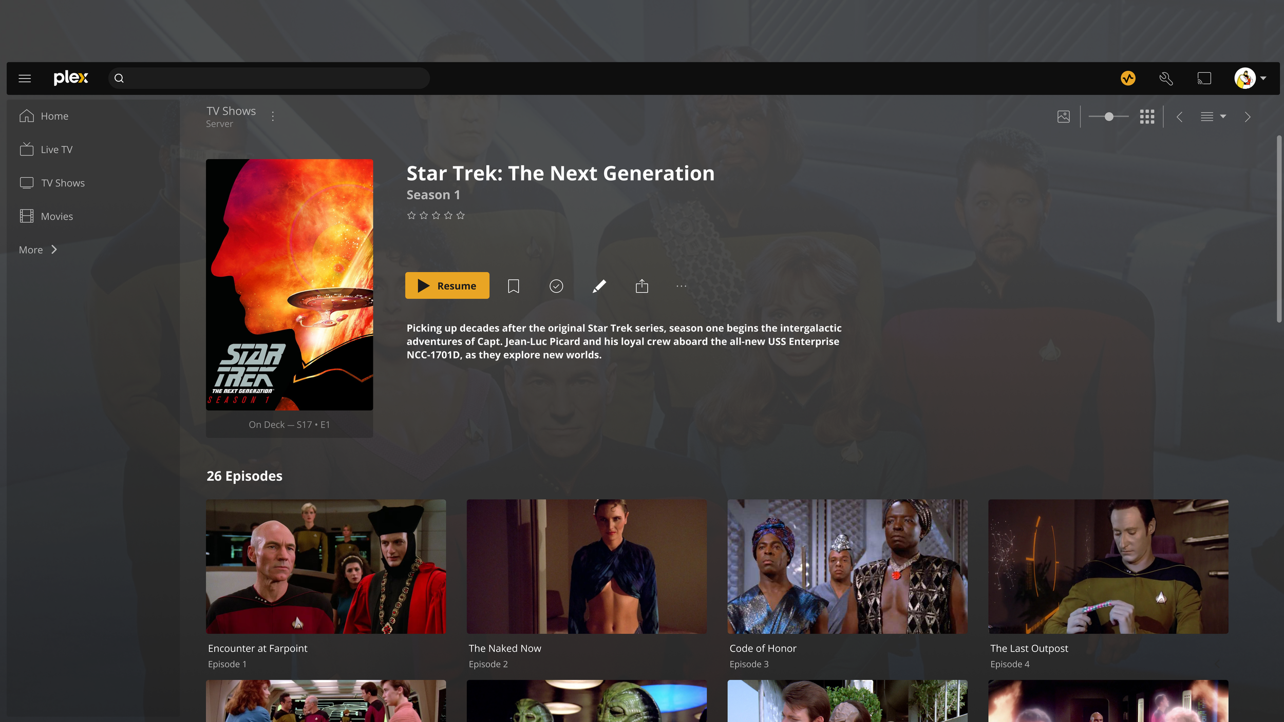
Plex Media Server is a software application that allows you to organize and stream your own collection of movies, TV shows, music, and photos, from a central location. Think of it like having your own personal Netflix or Spotify server that you can access from various devices. It’s a great tool for anyone who wants to streamline their media consumption and take control of their entertainment experience.
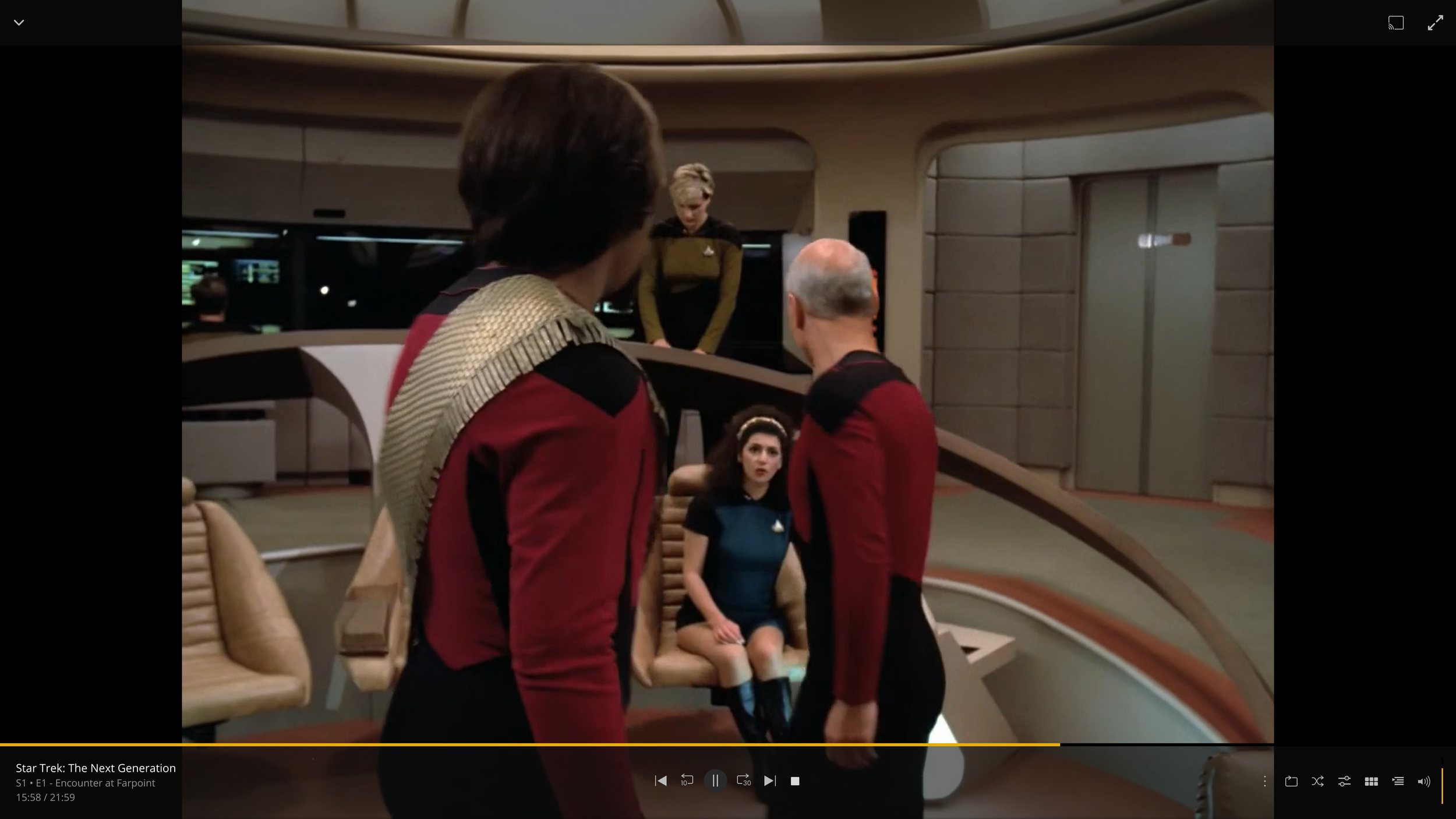
I believe that implementing a feature enabling users to pause their videos to access information about the actors appearing in the scene, along with details about the musical score playing at that moment, would enhance the user experience. This functionality would, not only, display information about the actors and their filmography, but also allow users to explore the artists' discography.
Project Name: Plexray Vision | My Role: UX Researcher & Designer / UI Designer | Timeline: 2 Months
Design Process
-

Empathize
Research Plan
User Interviews
Competitive Analysis -

Define
Project Goals
Affinity Map
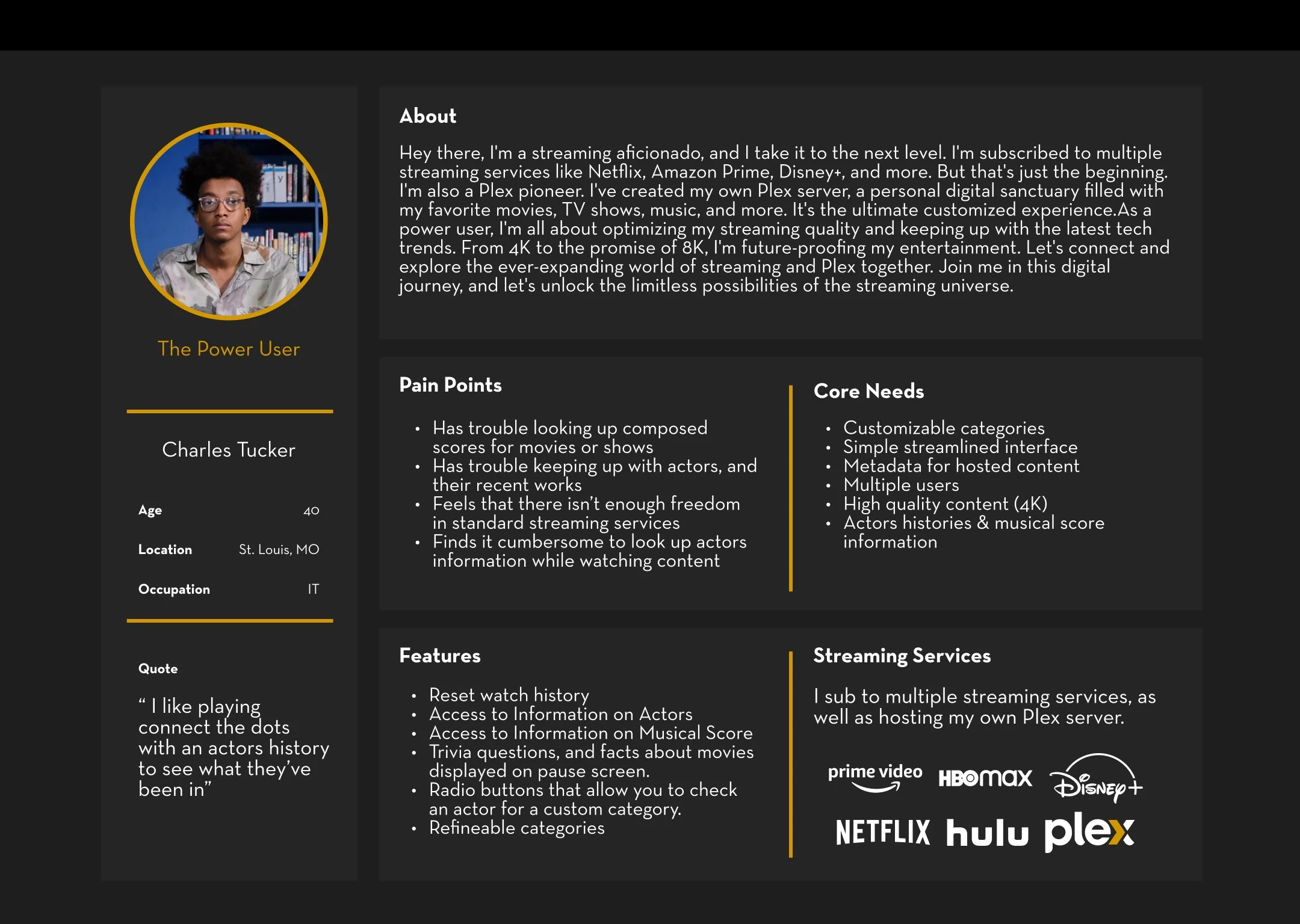
User Persons -

Ideate
User Flow
-

Design
UI Kit
Hi-Fidelity Prototype -

Test
Usability Testing
Feedback
Refine
Solution
User Research Plan
Plex is a customizable media service where users can build a personal streaming platform. Tiered services allow for a wide variety of user experiences and opportunities. I aim to see how users currently use and watch streaming services. I also would like to see how commonly users search for information about their content, such as actor histories and musical scores. These questions are designed to potentially point out key details about a user's viewing habits.
Research
Goals
Identify user viewing habits.
I want to gain a better insight into how users view their content.
Determine how users search for actor histories and musical score information.
People often search for an actor’s history or try to identify what song is playing in the background of their content. I want to determine how users search for this information.
Review other streaming platforms, and which ones users prefer, and why.
User Interviews
Tommy A.
40
Dan S.
38
Almir A.
47
Gerard B.
38
Cage C.
28
Kiko K.
35
Robert S.
38
Research Findings
The user research reveals a highly engaged user base familiar with managing media through Plex Media Server and subscribing to multiple streaming services like Netflix, Hulu, and Disney +. Netflix is favored for its user-friendly interface and extensive content, while Disney + is valued for family-friendly options. Users frequently search for actors and enjoy exploring their filmographies, often using IMDb or Google for information. They find musical scores important for setting the tone in movies and occasionally look up songs during viewing. Despite limited exploration, some users appreciate the X-Ray feature on Amazon Prime Video for on-screen actor information. Overall, users prioritize ease of use, content variety, and supplementary features when choosing and interacting with streaming platforms.
Competitive Analysis
-
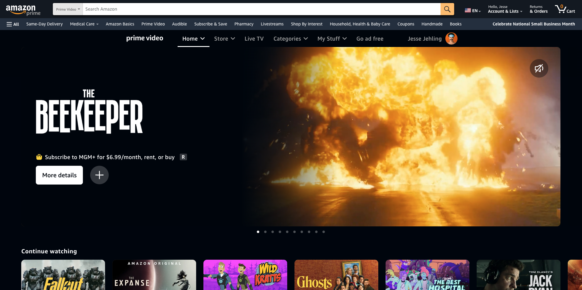
Prime Video
Prime Video is a streaming service provided by Amazon. The service is included in a Prime membership.
Strengths: Original programming and High-quality content.Weaknesses: Limited users per plan. Poor search functionality. High monthly cost.
-

Hulu
Hulu aims to empower and inspire a world of streaming freedom and be the unsurpassed streaming partner for our customers.
Strengths: Simple UI. It is bundled with multiple streaming services.
Weaknesses: Limited original programming. Ads in most tiers. Incomplete show series.
-
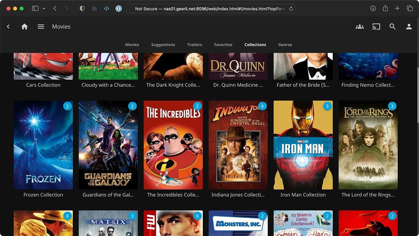
Jellyfin
Jellyfin aims to be the best free and open-source media streaming platform possible, without proprietary/locked features or unreasonable centralization.
Strengths: Has free tier. Privacy focused. Fully customizable.
Weaknesses: No customer support. User hosted. Technical complexity. Does not support multiple users.
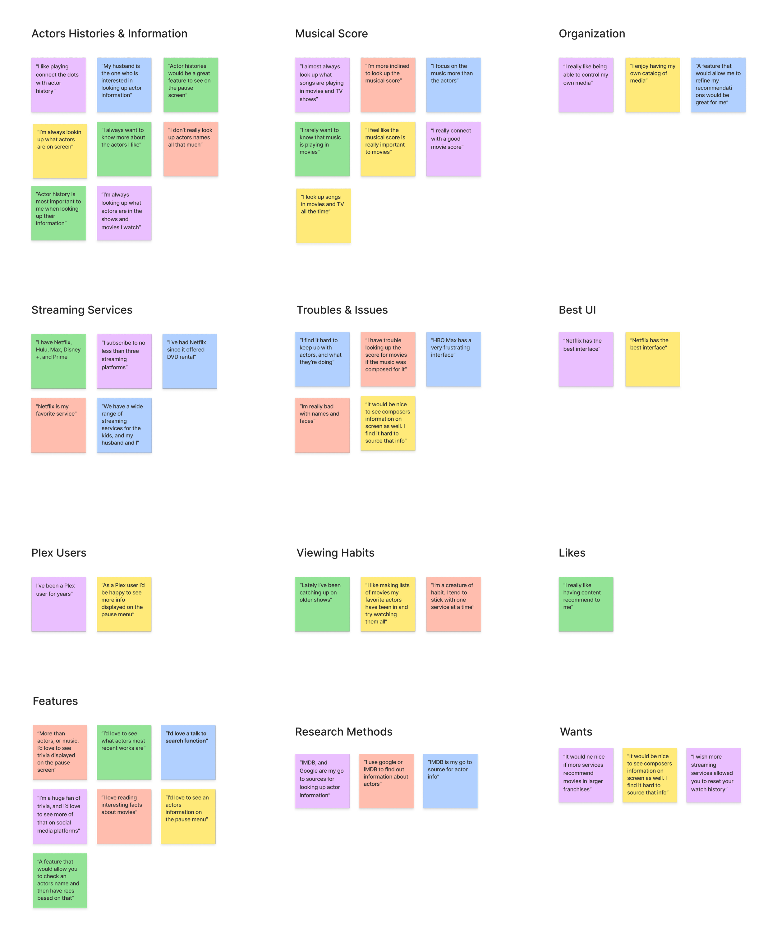
Affinity Map
The Affinity mapping suggests that users struggle most with acquiring ingredients and finding recipes that work for their cooking knowledge, dietary restrictions, and family structure. These things have validated my original thought that a social community approach to cooking would benefit users by providing them with the tools, and knowledge to feel more comfortable cooking, and possible workarounds for their challenges.
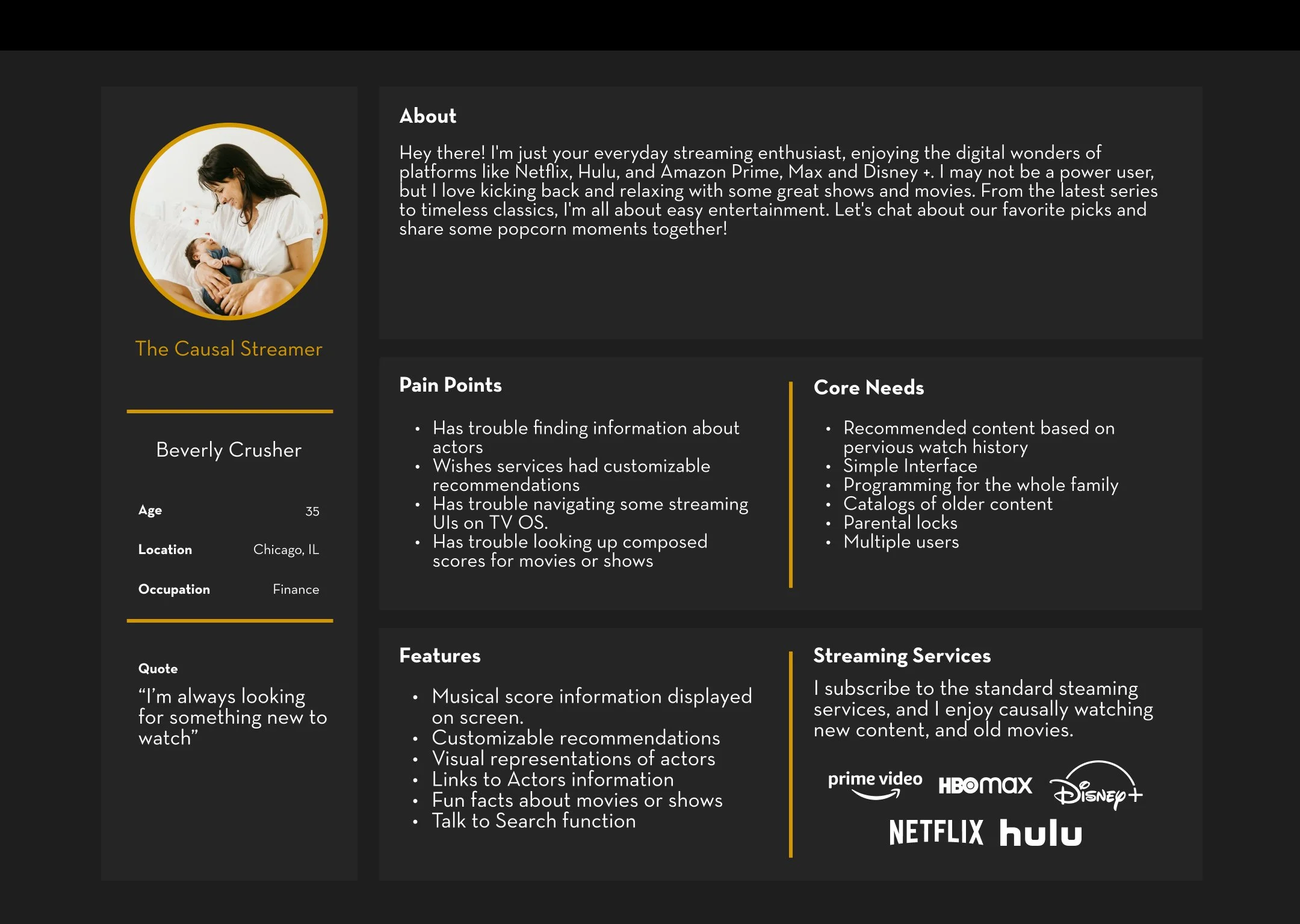
User Personas
User Flows
The flows are . I designed the navigation with that in mind to try and provide a familiar experience.

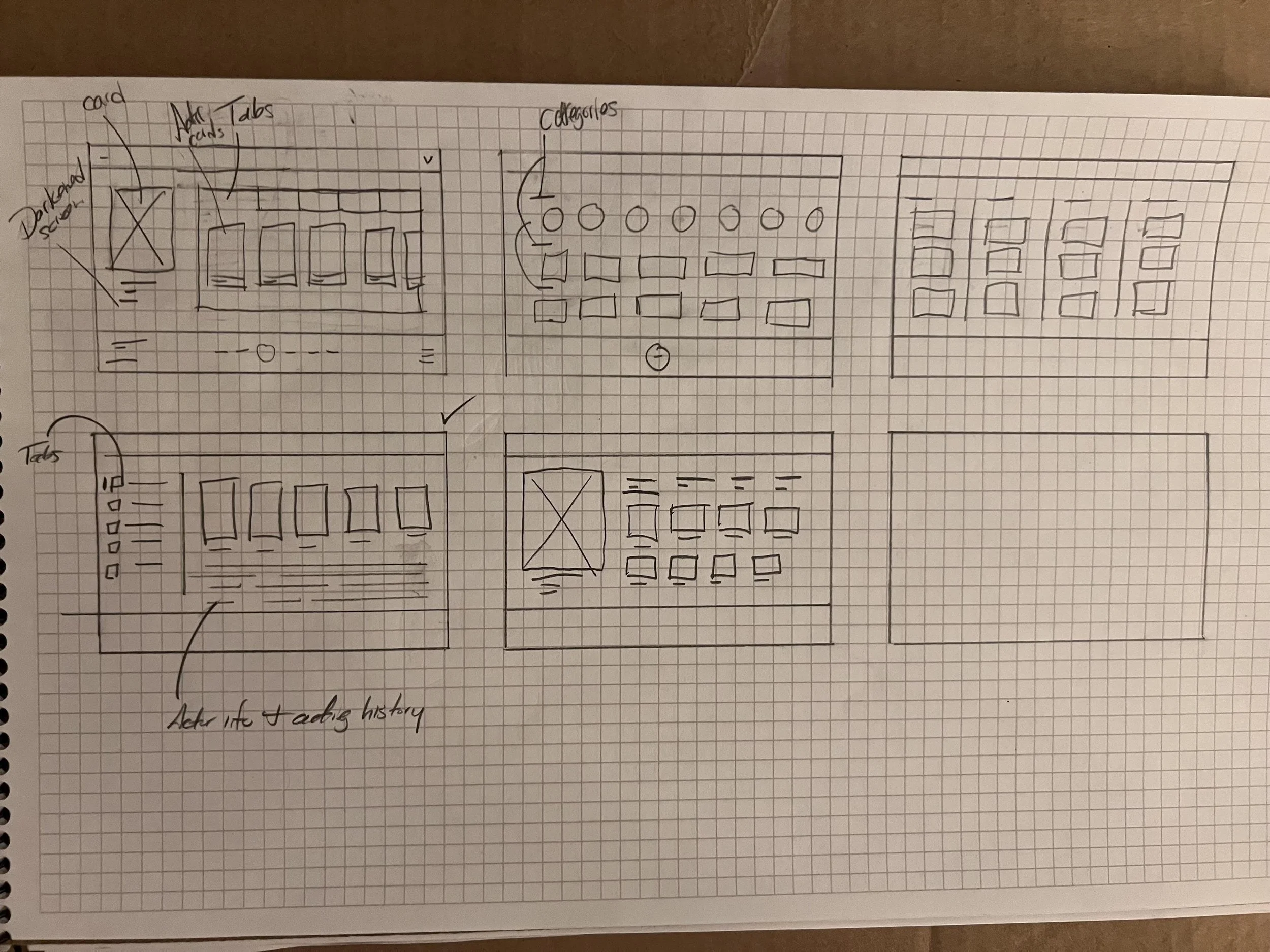
Sketches
Several options were explored using the design system. Option 4 was selected as the starting point for the lo-fi wireframes because of its simplicity and resemblance to the existing interface.
User Testing
Goal
Allow users to interact with a basic wireframe showcasing the intended feature. Users will navigate the interface during a moderated test I oversee. They will be prompted to select a TV show, pause the content, and choose an actor from a provided list.
Participants
5 previously interviewed users were chosen to run the test. The measure of success will be determined by how users navigate the interface without fault, hit any roadblocks, and their overall opinion of the layout.
Feedback
All users found the interface to be clean and simple. The primary feedback that needs addressing pertains to the layout of the actor's screen. Participants felt that displaying the actor's history on the same page as actor selection might confuse users when choosing a specific actor. Additionally, one user raised an accessibility concern regarding subtitles: if the pause screen occupies the entire space, subtitles could be minimized or completely removed from view. These insights have provided valuable guidance for structuring the next iteration of the wireframes.
Next Steps:
Taking the feedback into consideration I want to refine the design of the pause page and reevaluate the accessibility of the design. I believe these changes will improve the overall UI, and user flows.

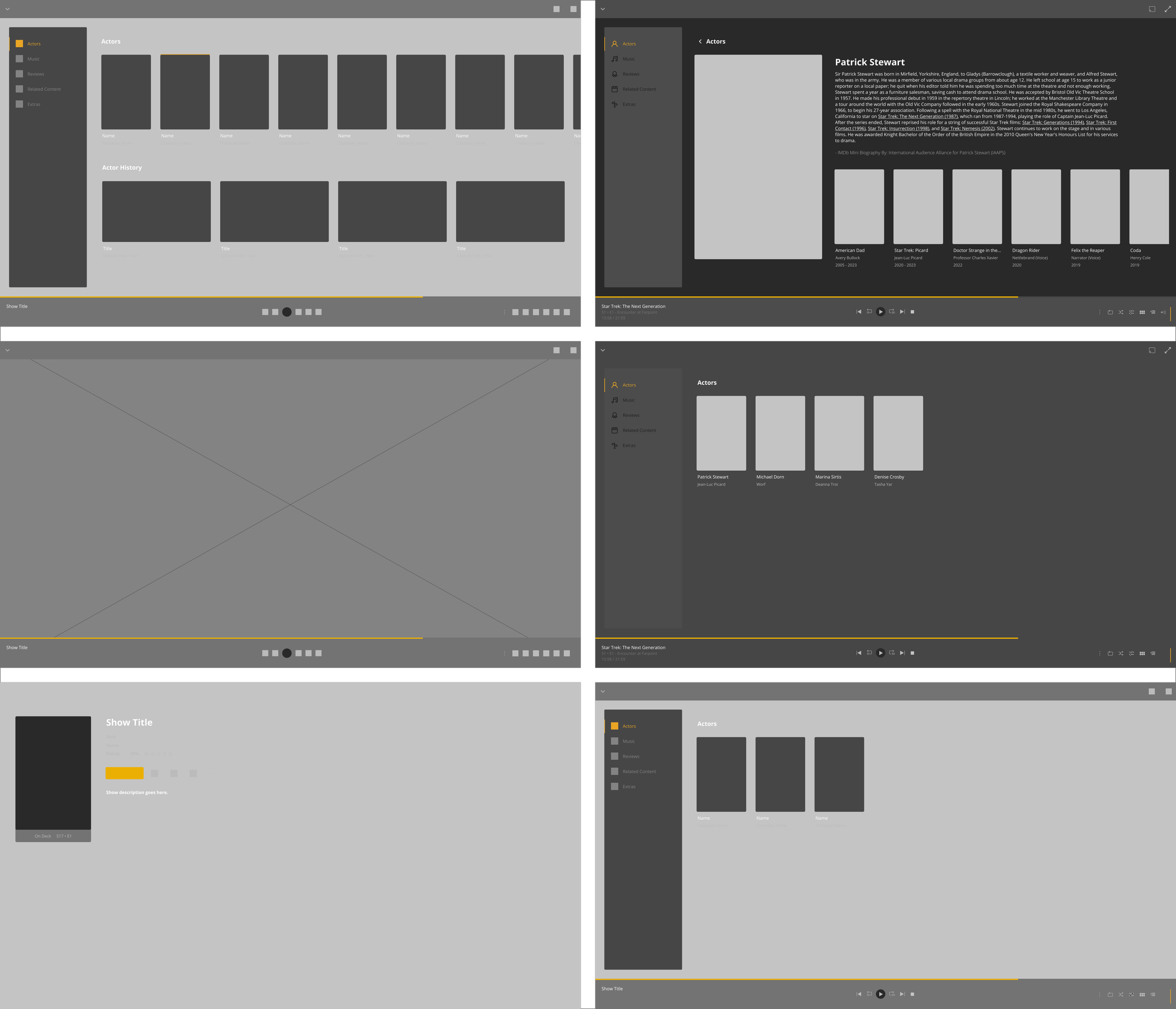
Lo-fi Wireframes
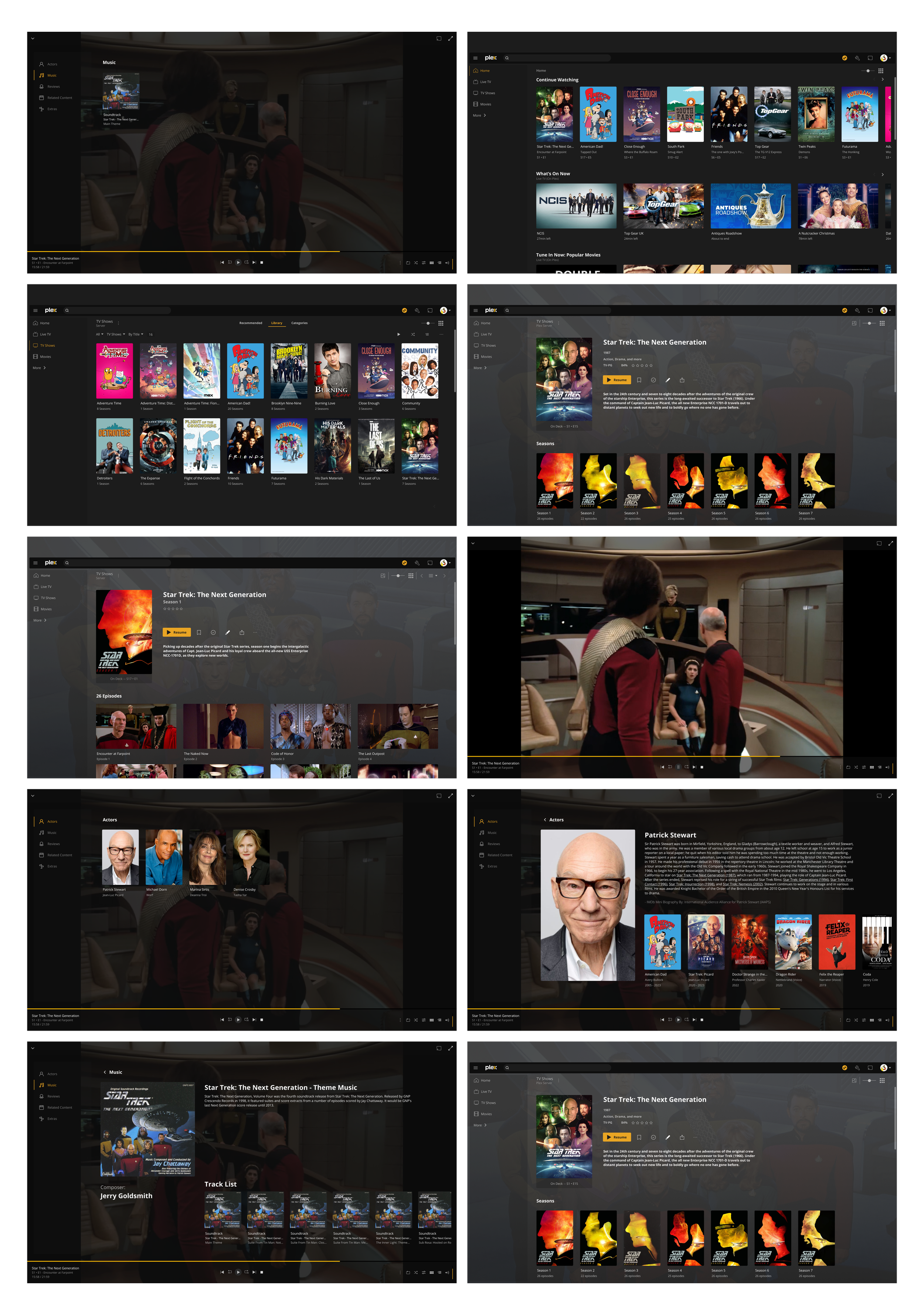
The sketches and subsequent lo-fi wireframes were both created in Figma. I began with a design system and took the opportunity to reconstruct their elements from scratch. This approach made it simpler to iterate and adjust my ideas before fully committing to one.
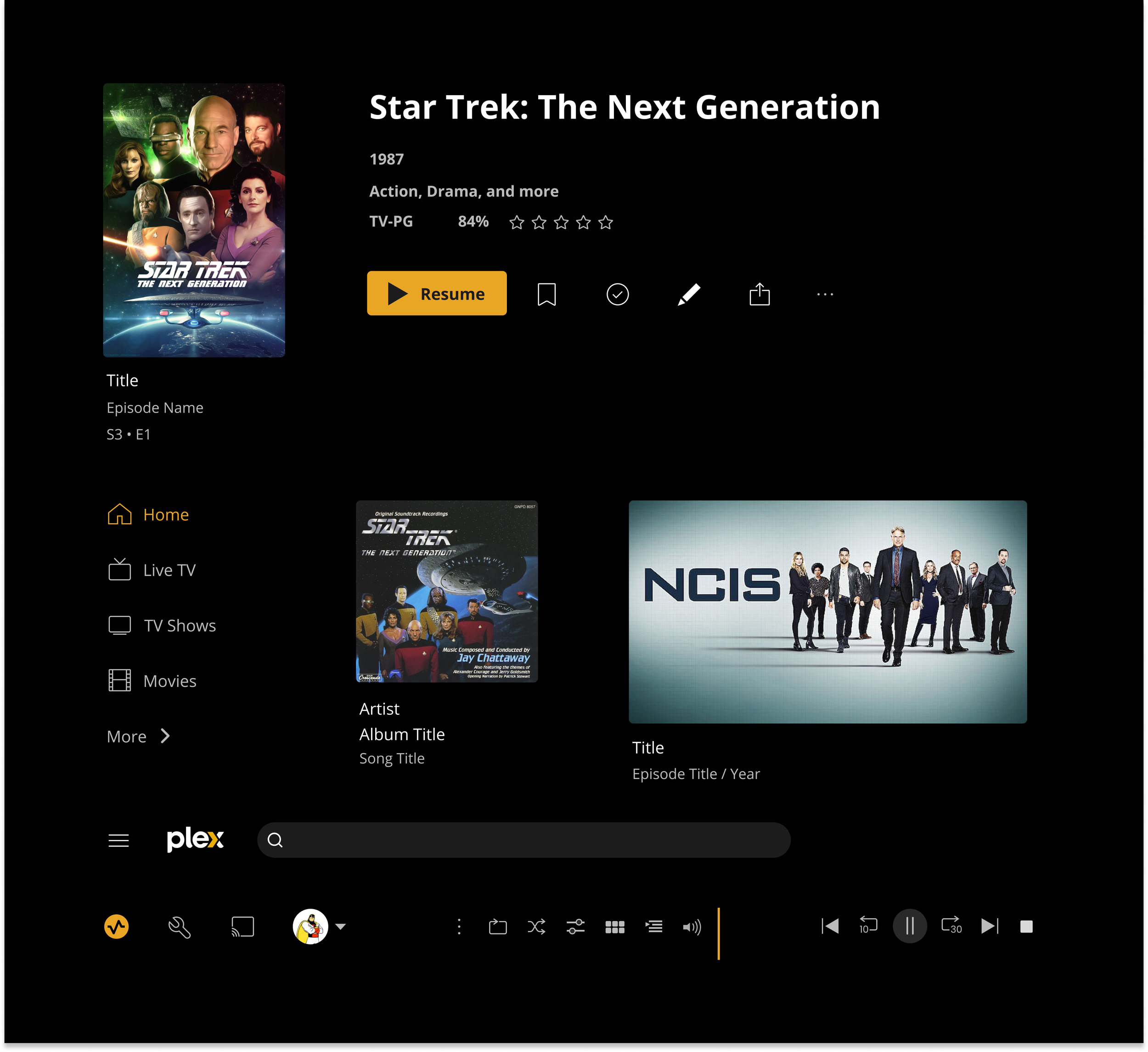
UI toolkit
Open Sans was used to replicate the original UI components. I learned a lot working with an established design system.

Hi-fi Wireframes
The high-fidelity wireframes are based on the established design system. The addition of this feature would be simple, cheap, and efficient.
Usability Test
Goal
Using the existing personas and previous user testing results I aim to run users through the updated interface. My main goal is to determine if the current pause screen layout is simple and easy to navigate.
Participants
3 previously interviewed users and 2 new users were chosen to run the test. I’ve chosen two users who are unfamiliar with the previous testing to get a fresh perspective on the proposed solution.
Tasks
Task 1
Please start by selecting Star Trek: The Next Generation from the “Continue Watching” section on the landing page.
Then Select Season 1, and choose Episode 1 “Encounter at Farpoint”
Task 2
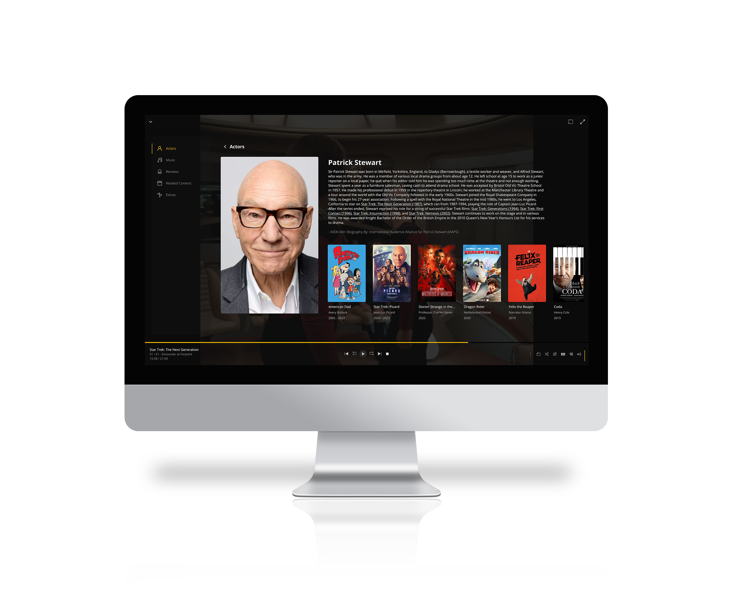
Pause the video and choose Patrick Stewart from the actor's list.
Navigate back to the pause menu
Task 3
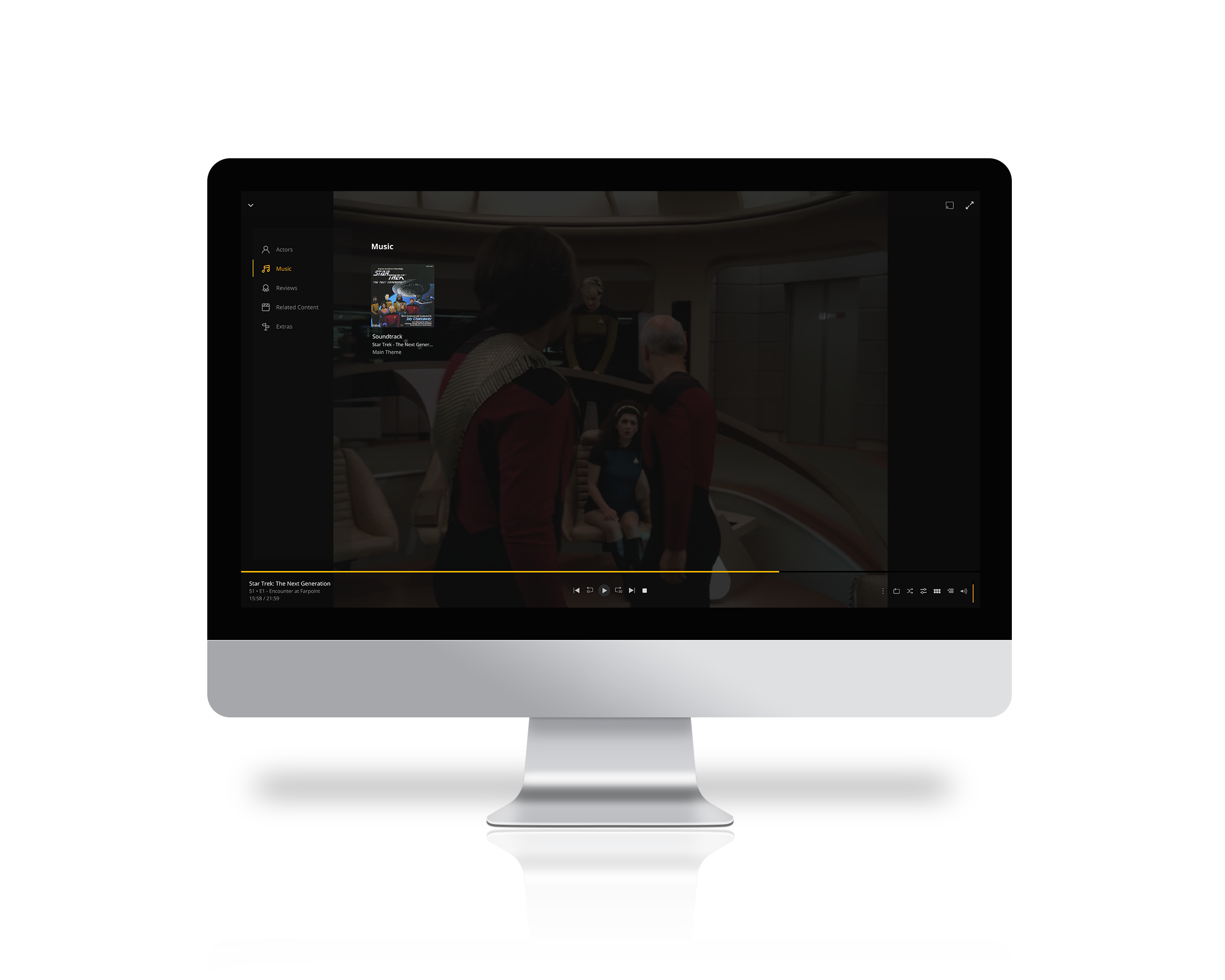
Choose Music from the side menu
Select the song from the music menu.
Resume watching video

Usability Test
Methodology
3 In-person interviews, and two online. All interviews were moderated with a controlled prototype.
Task 1
Choosing a show, and select an episode
All users worked through the task without any issues. The simple design system allowed the user to seamlessly navigate the interface. One user expressed that the “layout is so easy”, “I wish Netflix worked like this”.
Task 2
Chose an actor from the actor’s section of the pause menu
Users enjoyed the simple layout of the pause menu and its new features. One user found the interface really helpful and expressed their desire to have this on other streaming services. Another user suggested increasing the font sizes for more visibility for users with poor eyesight. One user suggested having a check box, or radio button to select the actors while browsing the menu so they could review them later.
Task 3
Choose a song from the music tab then resume the content
The users felt that the layout was very simple and easy to use. While music wasn’t as important to all the users two of them felt that this would be something they’d use quite often if it were implemented. One user expressed how hard it is to find musical score information on their own. “Having all of this information in one place is so great!”

Seamless Searching
Users can effortlessly pause their content to access the information they need, seamlessly integrating their search without disrupting their viewing experience.
Actors & Score
Users valued the ability to search for actors and music. This feature enables them to do just that and more. Looking ahead, reviews and additional extras will also be incorporated into this screen.
Prototype
Give the prototype a try and let us know if you have any feedback you’d like to share!
Email us with your suggestions, and thoughts. We’d love to hear from you!

Reflection & next steps
Reflecting on my experience within the existing design system has been eye-opening, giving me deeper insights into how different designers approach solutions. It's fascinating to see how design choices impact user experience and functionality.
Users really appreciated the current layout for its simplicity and ease of use, which is encouraging. Our next step is to fine-tune font sizes based on their feedback to enhance readability and visual flow.
Looking forward, there's excitement about potentially adding extras like trivia or deleted scenes, which users mentioned would be a cool addition. Beyond just meeting user preferences, these updates align with our business goals of increasing engagement and attracting new users.
Looking forward:
Font Sizing: Make adjustments to ensure the copy is clear and
well-balanced on the screen.
Feature Exploration: I’d like to explore possibilities for adding extras and review sections, including popular requests like trivia and deleted scenes.
This iterative approach aims to continually improve the user experience while aligning with business objectives, fostering a platform that is both user-friendly and strategically positioned for growth and success in the marketplace.
Let’s Chat
What can I do for you?


